


Logo Pre-Development
Now, after all the build up, you get to see some of the work we've done developing our identity.
Going in, we knew that we wanted the logo and the mark (that symbol that you'll see near a business name) to not only promote the simple, clean, friendly and professional attitude we're bringing to the development of the product suite, but also to tell a bit of the story about how everything works.
Advertisers deserve to have better control over their advertisements. We've got a way to track the effectiveness of your ads, both on and offline. The approach allows you more information about who's calling, emailing and visiting your websites. We wanted Biego to figure out how to tell that story in our mark.
AdSymetrix is going to be a tool to help you run your business. But it's just a tool. The less time you spend figuring out what we're doing for you, the more time you can spend managing your own success. So we wanted to make sure that the eventual look and feel was simple to understand, professional and empowering.
We passed along some suggestions to Biego.
A font:
A possible color scheme:
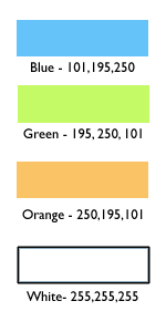 And all the brand strategy materials we could get our hands on.
In the end, they developed a set of logos and colors that we're really excited about. But you'll have to read ahead to see those.
posted by Anonymous at 12:14 PM
![]()
![]()

0 Comments:
Post a Comment
<< Home