


Our First Logo (draft two)
After we'd discussed what we liked and what we didn't about the logos presented to us, we were happy to receive a new set of options
Each had an icon that would help explain the tagline and our core business - calls, clicks emails
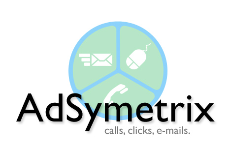
The first had the partitioned circle behind the name
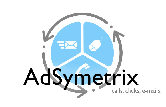
The second included a set of arrows that would show how everything is connected
 The third takes that same idea and deploys it in a different way
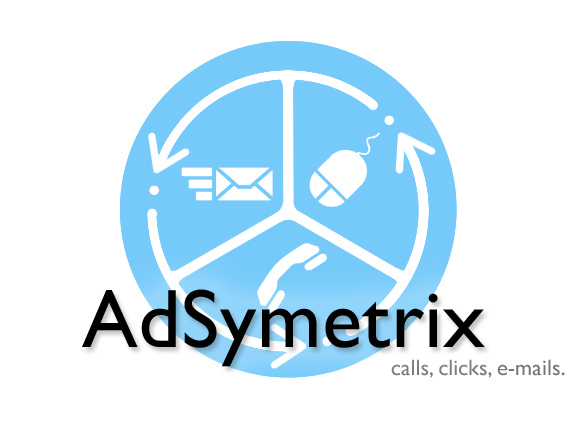 And finally, the sunset of the mark behind the name with the icons inside a partitioned circle.
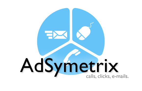
We liked the general approach to the circle. Liked that the logo's mark had all the icons in it that we could use throughout our application. But we thought that maybe having a sunset as a logo was a self-defeating idea. Instead, the idea came up to shrink the logo's mark and fit it at the end of the word. Giving the mark a position of punctuation, and making it appear all the more powerful.
posted by Anonymous at 1:01 PM
![]()
![]()

0 Comments:
Post a Comment
<< Home