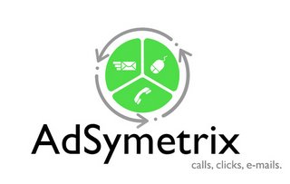
Our First Logo (draft three)
The final set of logos brought home our brand in a way we never quite expected. It made everything seem like it was right. Like we were headed down the correct path the whole time.
The first logo in this wave of drafts brought about the sunset concept, but included the new color scheme and the arrows/icons/partitions that we liked so much from our last attempts
 Knowing that we didn't want to have the logo behind the name, we decided that this wasn't the best way to go. Instead, the next offering showed the mark in front of the name
 A better option, but somehow uninspiring. We love the mark, we just think that by pushing it ahead of the name we lose some impact.
Which brings us to the final, approved logo
 It's strong. It's simple. It shows you what we do. The placement of the mark behind the name means that your eye reads the name, sees the mark then follows the arrows back around to the name and tag line all over again and speaks to the fact that we are an application that tracks advertising.
So now, we've got a name, a color scheme and now a logo. And that's just on the front end. You should hear about the programming development we've got cooking on rails.


0 Comments:
Post a Comment
<< Home